

Buenavida Visión
BRANDINGThe brand starts from an element with strong emotional value for the company: its family history. Taking the initial of the Buenavida surname as a starting point, we created a symbol that connects the founders’ legacy with their professional practice, reinterpreting the B to merge it with the shape of an inverted pair of glasses.
This union of the personal and the functional gives rise to a distinctive visual asset, able to convey recognition, warmth and a direct link to the world of optics.
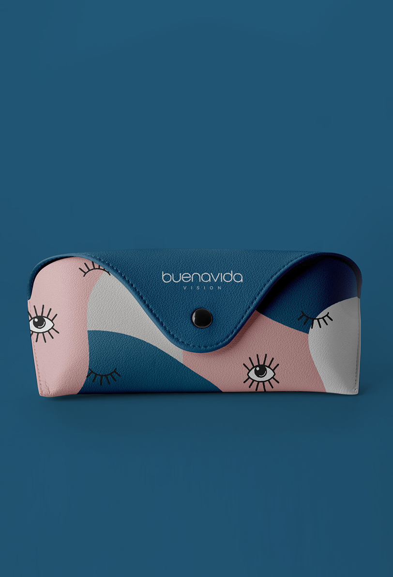
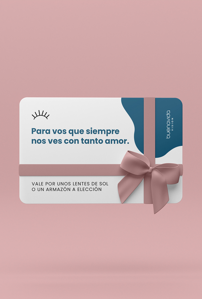
The system is complemented by a typeface with soft, rounded forms, chosen to match the personality of the symbol and reinforce an accessible, clear and trustworthy brand.
The proposal brings together the company’s family values and its professional expertise, building a visual expression of its own, aligned with the essence of the brand.